


You all saw the inspiration board last week which got me started in this rebranding process. Actually, I should say that the inspiration board was a culmination and stepping stone in the rebranding process. From the start of my business almost 6 years ago I have heard so much about “branding” – define your brand, hone your craft and turn it into a brand, your branding should be a reflection of yourself and your work, etc, etc etc. It was a lot to take in, a lot to think about. All along I knew that my current “brand” said nothing about me. It was some colors I like (grey, white, light blue/teal) and a random logo that I made one afternoon when I realized I needed a logo. But the bottom line was that it said nothing about who I am as an individual or who we are as a business. When I began the process of rebranding last year I had to ask myself some tough questions.
These last 6 years, to say the least, have been a time where I have really found myself and have come to realized the things that make me who I am and the things that set me on fire. As I began clipping pictures and dragging images and items onto my desktop I began looking for a red line through it all. On top of that, I looked around. I looked at the pictures I had hanging on my walls, the “props” in my bedroom, and the things that I generally tended to hang onto rather than toss out. Almost all these things had something to do with another country – that necklace I bought at the flea market in Peru, the vase I bartered for in Egypt, the photos of that kid in Africa who melted my heart. When I decided to go with some sort of travel-inspired branding I began searching online for things for an inspiration board. The problem was that almost everything I found (and that are on my board) were brownish in color, had a vintage feel to them, and weren’t *really* me. They were nice but something was still missing. Then I began thinking about the colors and textures I loved. Many of you know I lived in Denmark for 5 years and while there I became intoxicated with the beauty and simplicity of Danish design and style. Initially I thought it was impossibly boring and dull but as I stayed there longer I began to really appreciate it. It was only a matter of time before I fell in love with their white walls, clean lines, little pops of color, and furniture pieces with character. I have rarely been to a Danish home to see the walls painted a color. Color came in subtle touches here and there, and often with just one item in the room. A bright red couch, a yellow lamp in the corner, a turquoise chaise in the study, a grassy green area rug in the nursery, or sometimes just some fresh flowers on the kitchen table or a bright blue bowl on a shelf. If you have any doubt, google “Danish interiors”.
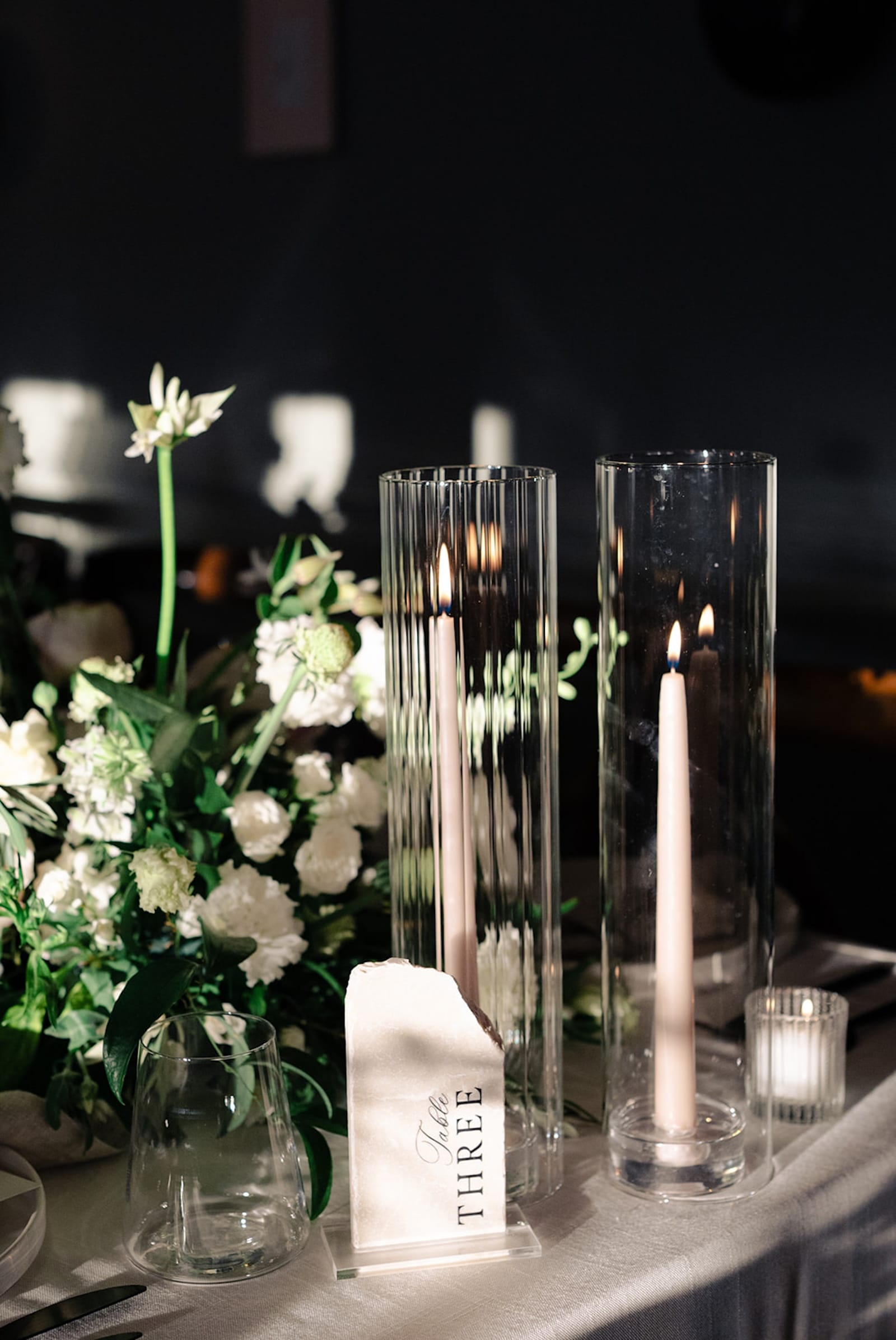
I decided that I would somehow take the vintage travel inspiration board and turn it into a clean, Scandinavian feel. A little bit of texture here, a little bit of flat mod graphic there, overall monochromatic scheme and then a pop of color. I went to a fabric store one afternoon and I began to feel. That’s what we all do anyway, right? When walking through out favorite store, we see that gorgeous cardigan out of the corner of our eye and our very first reaction is to go over and feel it. So that is what I did. And I found that I was drawn over and over to textured grey and white fabrics. From there I looked into my craft box – which is a hodge podge of ribbons, glitter, scrabooking things, etc. I looked for buttons and ribbons that spoke to me. I have been a longtime lover of grossgrain ribbon – whether tied in my hair as a headband, or to wrap a pretty gift. So grossgrain ribbon it was. I had to find a way to incorporate that into my site. Right from the start, I wanted it to be about “feeling”. We are emotional creatures. I love going to other websites and feeling something. I love being moved by an image or a story. I especially love when people visit my blog and tell me how they “felt” something when looking at my images. So I wanted the look of the new blog and website to be something that was felt by me and hopefully, in turn, felt by those who visit it. I hope it makes them feel good, happy, calm, and hopeful.
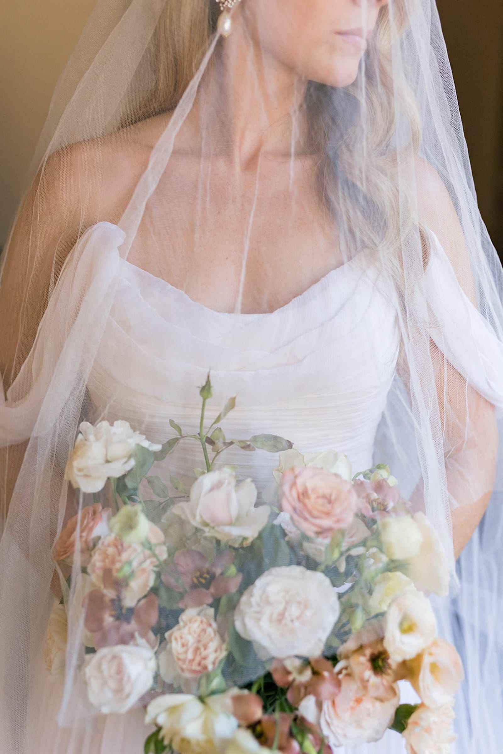
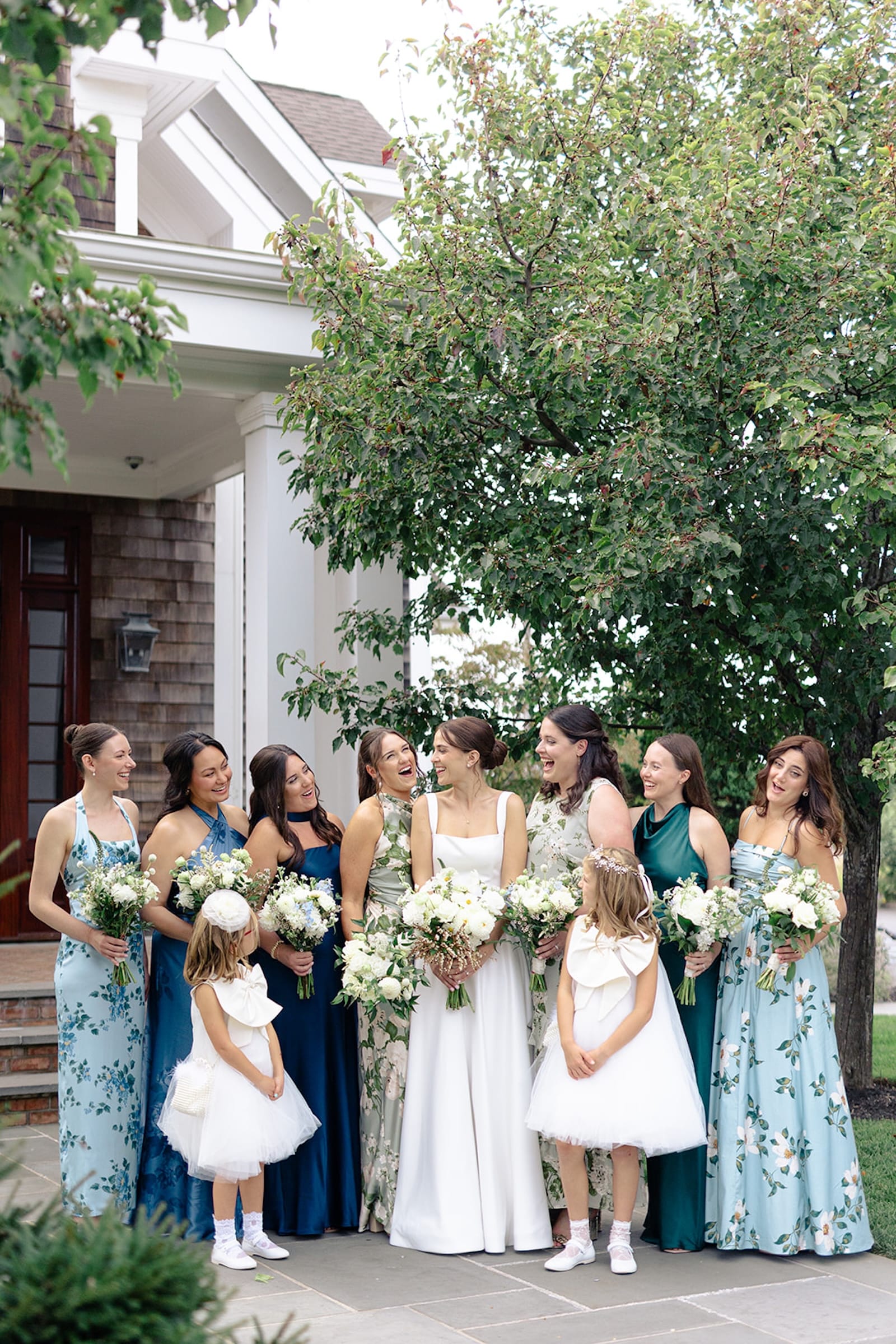
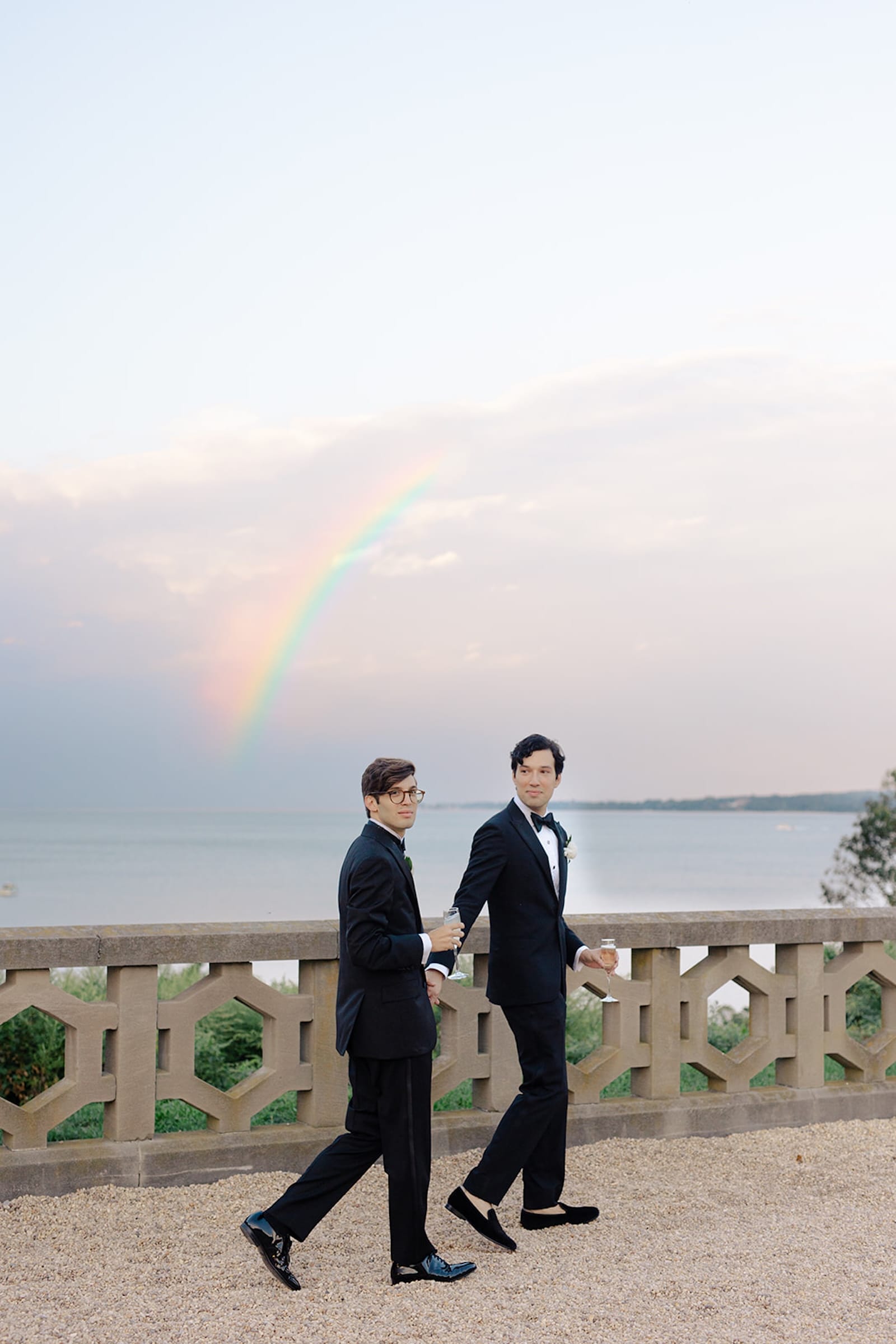
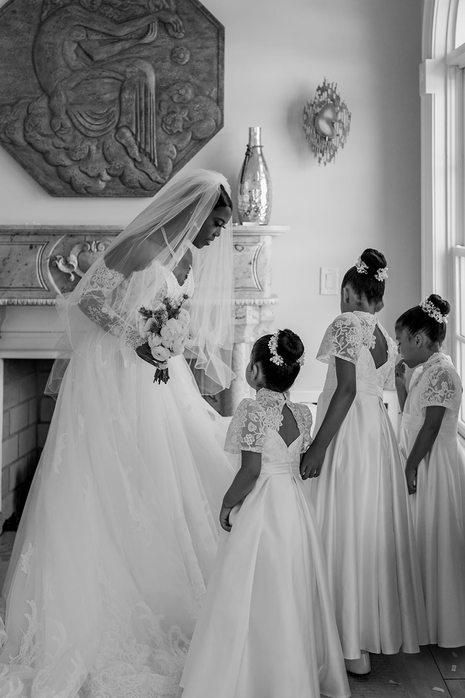
So here is a sneak peek of some of the “feel” of what my new website and blog will be like…


-2")
Very exciting. Can’t wait for the big reveal. 🙂
Can’t wait to see it all!!
These are STUNNING! 🙂
umm…that comment was supposed to go under Rebekka & Mikkel part 4, sorry!